GRAPES
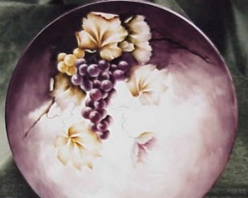
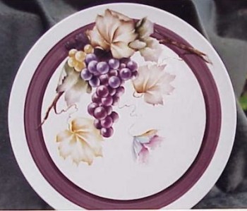
One Design-Two Ideas
by Alice Wofford
Alice is an accomplished porcelain artist who can tackle any subject, including portraiture. She is available for commission work and seminars.
email Alice at sam5416@flash.net
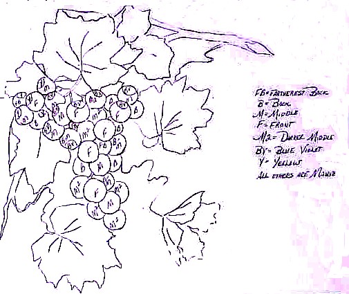
LINE DRAWING........click hereCOLOR PLACEMENT MAP.........click here
This lesson can be finished in two different ways. The grape painting is the same on each but the addition of the background on the first plate and the substitution of a banded border for the background in the second piece lends each one a distinctly different flavor.
|
|
|
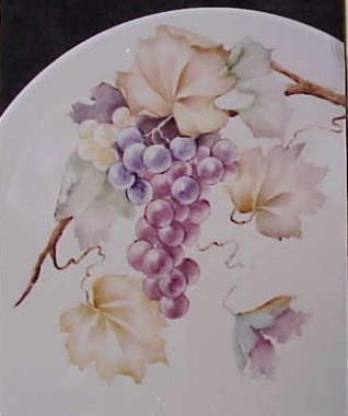
Note from Alice: I did not do the original design for these grapes and I regret saying that I don't know who did. I took them from a photograph taken in 1982 by a friend who took the photo at a convention. It was worked up for this lesson because the design is so pleasing. Before we begin, I would like to state that there is no right or wrong way to paint. Each person develops his or her own technique. What I am about to instruct you in is MY way. That is not to say that I wont change the way I do things in the future, but as of now, this is how I do things. If you prefer to paint grapes differently, that is fine but I ask that while you are in my seminar, you follow my instructions. As you look at this design, you will notice it is made up of threes and triangles. There are three colors of grapes: yellow,bluish purple and reddish purple......three shadow leaves: the one behind the design and the two that are in half shadow and three yellow leaves. The only oddity is the weird leaf off by itself. This can be left out if you don't like it since it is the only non-essential part of the design. The main reason it was kept in the design is because it makes the leaves the odd number that we are told to keep. The stem runs through the design in a "C" curve and not only does it give motion but it keeps the design from being too angular. You have been given two line drawings: One plain and the other with little letters on each grape. This second drawing is to help you know which grape is underneath and how far. It also lets you know which color is used on which Grape. If all the grapes are the same depth, you will have a flat design. Remember that a line drawing is not set in stone but is a guide as to where the leaves and grapes are to go. If you want to add or remove any grapes, do so but keep a pleasing design. Sketch or trace the design on your china. These are round grapes but you don't have to have each one perfectly round. Nature doesn't work that way and our paintings should reflect nature. You should also remember that grapes, like roses and mums, sometimes "grow' as you paint. You may start out with a tiny grape and by the time you get through with your wipeouts, its a much larger fruit. You should be careful with this point since it can change the entire design if one single grape is much larger than all the rest. One other point to remember: while you always want to paint the correct leaf for whatever flower or fruit you are working with , you don't always have to have the correct size. Grapes are a good example of this. The grape leaves are very large and can completely control a design if they are all painted the correct size. We as artists have a license to change things so that they are more pleasing, so most often when you see smaller leaves on a design for grapes, this is why. When painting round fruit, or anything else,
for that matter, you have more values than most people think. We are usually
told that we have a highlight, reflected light and a shadow. When painting grapes, you do not have to put the color on smoothly. As you blend and wipe out highlights and reflected lights, you will be shaping the fruit and smoothing the color. The only thing you need to watch out for as you put color on is paint build-up. Also, you should use as little oil as you can and still be able to move the paint. Highlights should be wiped out with a clean, oiled brush......the sharp highlights first, then the softer ones, but you can have color left in the brush for wiping out the reflected lights. Just be careful not to have too much paint left in. Remember that the pressure you put on a brush will determine the sharpness of the wipe-out. A lot of pressure means you will have a sharper wipe-out and less pressure means the wipe-out will be softer. I paint with a drying medium except when doing seminars, or doing portraits, when I use an open one. I also use a lot of paint. For these two reasons, my work at home is usually more intense than what I do in a seminar or than the students. But you will notice that what I paint in a seminar is generally more intense than the students. You need not be afraid of color. This is especially true with grapes because with all the blending and wiping out you will end up with no color if you paint light. There is also an old truism: your painting will be darker wet than it is dry and darker dry than fired. In other words, what you take out of the kiln wont be as dark as what you put in the kiln. The colors used in this design are: I also make mixtures of Mauve and Black.....and Mauve and Rose Leaf Green and keep them on my palette. This design has been painted with the same colors in the main design, but the backgrounds were treated very differently. The first fire is done in the exact same way, the differences come in the second fire. In one, I put a background and in the other, I left the background out and put a band of color around the plate. This was done to show that you don't always need background colors in a design and how the appearance of a design changes when painted differently. |
|
FIRST FIRE: The leaf that is painted behind the design is painted flat with a wash of Mauve/Black .Using a wipeout tool, wipe out the stems and soften the edges with an oiled brush. If the outside edges of the leaf don't look like a grape leaf, use the wipeout tool and carve out the shape. Be sure to completely remove all color you don't want in the negative space and to soften the edges so there is not harsh buildup of color. Sometimes the buildup of color is very pleasing in a painting , but I prefer not to have any on my first fire. The two leaves on either side of the design that are half leaf and half shadow are painted alike. Use Rose Leaf Green in the darkest area where the leaves are tucked under either another leaf or the grapes. Add Mauve/Rose Leaf Green to the lower edges. Don't be too distinct as this is the shadow part and you want it to be slightly out of focus. |
|
The top leaf is washed with Mixing Yellow with a touch of either Olive Green or Gray Green. It is then shaded with Chocolate Brown. Keep the brown shadows different values and leave lots of highlights so that the leaf doesn't look flat. On a grape leaf, you have a main central vein and a main one that goes up into each lob of the leaf. And when you are tracing them, that is all you need to trace, so you know where they're going. As you pull your paint down toward the central vein, pull it at an angle , so that you are painting down toward that central vein. The when you paint the other side, you pull the same way , only lighter. Pull away from the vein and make your little notches as you paint. They have lots of notches on them and you want to get that look going. Make sure you have nice points on them because they are very pointed and you don't want any fat, boxy areas. Push in from outside with either your brush or a wipeout tool to get that sharp, pointed look. The cluster of grapes will be worked in sections because there are three colors of grapes in it and also because you can see three distinct layers. Be sure to use a brush that fits the size of the grape and don't lose the shape as you wipe out. The yellow grapes are painted first with Mixing Yellow with a touch of Yellow Brown added so that you will be able to see where your highlights are wiped out. For these and all of the other grapes , wipe out the highlights and reflected lights after you block in the local color. Keep the highlights sharp where the light first hits the fruit. In any area where there is only a hint of reflected light, take a small wipeout tool and make a crescent shape. Next , with an oiled brush,lightly blend this edge to keep it from being harsh. The next section of grapes are the reddish ones, which will be painted in Mauve. Again, divide the grapes of this color into three sections. Block in the grapes that are the furthermost back first using the Mauve. These grapes will have the least amount of wipeouts. You will need just enough wiped out to establish the reflected lights and give them shape. You can leave just the wipeout mark without any softening or blending, but the grapes will look flat, not round. After you finish this level, go to the mid-depth grapes and block in the color...then wipe out the highlights and reflected lights. Last, block in and wipe the top layer of grapes. These grapes will have the most highlights to them and will be lighter in color . Be sure to leave the sharp highlights where the light hits. The third color of grapes will be done in Blue Violet. There are seven of these , plus two which are a mix of Mauve and Blue Violet. Block in the first seven and wipe out the lights. Work the last two grapes the same way. The next two leaves will both be started with a light wash of Mixing Yellow. The one on the left is shaded lightly with Chocolate Brown and Yellow Brown mixed on the brush. That is all that is on this leaf on this fire. The other leaf is shaded with Chocolate Brown and a bit of the Mauve/Rose Leaf Green mixture. The last leaf is the only one that can be left off if you don't like it without changing the design. It is a make-believe leaf and is painted with strokes of Chocolate Brown, Mauve, Blue Violet and Baby Blue. This leaf doesn't have to be made to look natural. Just a suggestion of a leaf. The stem has a woody texture, so form it with choppy strokes, not smooth ones. Start on the shadow side, then add color to the light side. Lightly blend across the stem. This same color is used to make thin stems to the two yellow leaves and the Mauve/Rose Leaf Green mix is for the stem to the odd leaf. Use a wipe out tool and go through these thin stems to Keep them from being too distinct. One note here: when making stems on any object, be sure that they go the correct way. In other words, you should have stems that go through the design from one side to the other, not several that go into it any which way without a reason. FIRE cone 014 or 015 This is where the designs differ. One will have a background and other other wont, so these instructions will be for both, but if you are painting the one without the background, just ignore that part of the instructions. On each successive firing,we will be wiping out less and less on the highlights and leaving more and more color. When painting the second fire on grapes, you will still have a lot of highlight on the fruit, but there will be less of them and not as sharp. The only real highlights will be where the light strikes the fruit. This shrinking of highlights helps give a bit of texture and shape to the grapes. A grape that is too smooth looks like it is made of plastic instead of natural. On the second fire, we will put a complete coat of paint on the grapes and then do wipeouts just like on the first fire, only enhance the leaves. The reason for the extra color on the grapes is so that the depths and shapes will be correct and make it easier to enhance the colors on the rest of the paintings. Since we should never put the same color over itself, with each of the following fires, we will add a little more of one or another color. If we were to paint Mauve over Mauve, our grapes would look dull and, instead of intensifying the shadow color, all we would do is make the color a darker version of the same hue. For this reason, when we paint Mauve over an area of Mauve, we will be adding Black or another color. It will change the hue and value of the Mauve just a bit but will also give depth to the painting. |
|
|
|
CLICK HERE to go back to the ON-LINE LESSONS PAGE CLICK HERE to go back to the PPIO HOME PAGE *on-line lessons and lesson pages are the property of PPIO and the contributing artists and may not be reproduced for distribution without permission from PPIO |