Checking Your Values

Part 1

By Marci Blattenberger

  We ALL struggle as artists..........Even the great artists struggle.They just struggle on different levels. Attempting to reproduce the three dimensional , colorful world around us on a two dimensional surface with pigments that are limited in their ability to duplicate the effects of light is a diificult challenge.
Add to that the fact the we have to fight the logical side of our brain every step of the way and it can feel like an insurmountable challenge.

A good friend of mine, Becky Syroka, once said something to me that I thought was an absolutely brilliant way of describing this challenge: She said that, as artists , we have to see things that are hidden from the casual eye. 
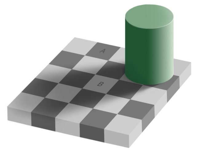
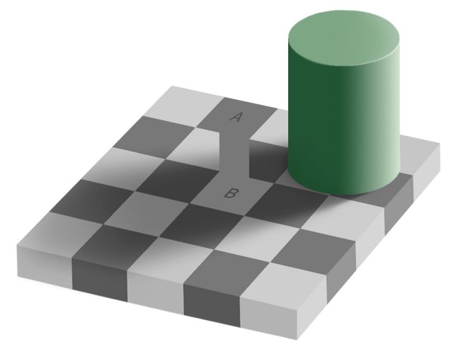
That is exactly what we are up against. Our brains process information like color and value in a very simplistic way as a survival mechanism.

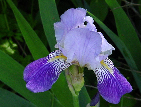
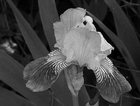
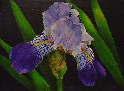
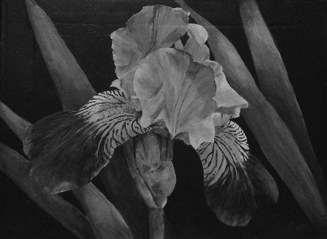
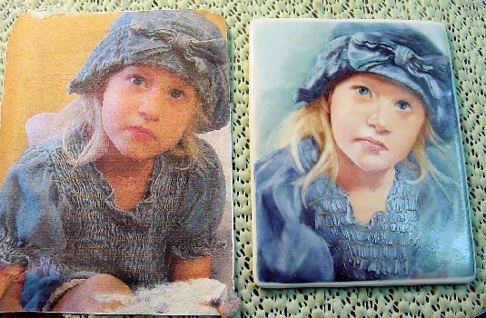
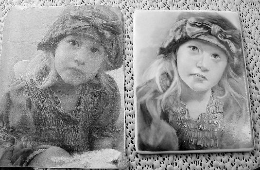
Proper values are an important part of any painting. The only thing we have to show three dimensions on a two dimensonal surface is value . NOTHING is as important as value.. not even color. The Impressionists managed to convincingly render many subjects using unusual color choices, such as bright green and blues in portraits... but as long as the colors are the proper value, the subject matter reads as dimensional . ( eg. Van Gogh used lots of vibrant, decidedly not-traditional portrait colors in his portraits)

But value is one of the hardest things to learn to see as an artist . Our brains are wired to make simple decisions about color and value to make it easier for us to recognise and identify things around us. We see a circular object and our brain is able to immediately process it as a shiny red apple by noting the highlights, shadow and color without noting the particulars... but as artists, our difficult job is to break through that simplicity and see and paint the complexities.

It is our job to note that the value and color of that red apple changes as it turns into shadow.. or rounds into the highlight.

Here is an amazing illusion that still fools me every time .

Square A and Square B are exactly the same value!! Hard to believe, I know, but print it off and prove it for yourself. ( Note that sometimes different printers will not quite print out the right value .. so the effect on a printed page may not be perfect.. but it will be close enough to prove the point )

What is happening in this illusion is that our brains are processing Square A as a dark square ( in the light ) .. and square B as a light square ( in shadow )... and our brains refuse to recognize the fact that A and B are the exact same value.

This same thing happens with color. Our brains are hotwired to ignore things like inconsistencies of light and to choose the most probable scenario based on previous experiences. An interesting experiment was done in an art class where the teacher set up a simple still life using several white objects, among them an egg and some shapes , like a styrofoam square and cone , that were not meant to represent a specific object.
She then arranged the objects against a white background and lit the still life with a red light.. and asked the students to paint what they saw.
The students properly rendered the box and cone using the shades of red that the objects refelcted due to the red lighting.. but every one of them painted the egg WHITE ! ( Despite the fact that the egg also reflected the red light ) ....They were unable to get around the preconceived notions that an egg is white.That is because our brains are wired to " read" an egg as white no matter what light it's in .

This is exactly what we have to overcome as artists. We have to be able to erase these preconceived notions and see what is actually happening in the scene we are trying to paint.

Another thing that we have to fight as artists is that colors are affected by their surrounding colors. There are countless illustrations on the net that show things like simultaneous contrast and how a color can appear bright when surrounded by a dull color and dull when surrounded by a bright color.

HOW TO JUDGE COLOR:

Color is a bit trickier because you have not only value to deal with but : HUE: the " color" of the color ( red, orange-red, blue etc ) The SATURATION : how strong the color is .. is it a pure red.. or a dull red? the VALUE : Is it a light red or dark red? Thats a lot to deal with ... PLUS the fact is that colors are affected by their surroundings...

So ... how do we overcome all of this? How do we learn to see what really is there and ignore what our brains are telling us?

Luckily , there are a few little tricks you can use to help see the truth . First of all,in order to become a good artist, you MUST LEARN TO DRAW! Yes, I'm shouting!
I know we all want to think there is some magic involved in becoming better artists.... a magic brush , the right paint... Well, get over it! I'm here to tell you that EVERY artist you admire worked long and hard to get there. They all worked to improve their skills... and if you can't draw, you can't paint. It's as simple as that .

The good news is that it isn't hard to learn to draw well. Really ! ...You just have to put in some practise time.

Here are a few things that will help you to train your eye and improve your drawing skills...

IMPROVING YOUR DRAWING SKILLS:

  • GET SOME CATALOGS ....If you paint flowers, get some seed catalogs or Jackson and Perkins rose catalogs. I do a lot of portraits so I buy fashion magazines like Vogue and Glamour when they publish their very thick issues several times a year.
    Then take a pen and start drawing all over the pictures. If you have a flower catalog, draw the way the leaves attach behind the flower, the way the petals attach to the stem, draw over the shapes of the highlights and shadows.
    Challenge yourself to find the most subtle highlights and shadows that you can . Challenge yourself to see color shifts.
    With the portraits, I draw out the shapes of the irises behind the eyelids, the lights and shadows, plumb lines to show the relationship of different edges ( eyes to mouth etc ) ...
    You can do this any time... talk on the phone and mindlessly doodle over the pictures... Doodle during TV commercials or while waiting in your car...
    Doodling over pictures like this trains your eye to see the subtle variations that you need to be able to see and also trains your hand to do what your eye is seeing.

  • CONTOUR DRAWING ...Get a piece of paper and pencil or pen and then focus in on an object. It doesnt matter what you focus on ... it can be anything, including your hand.
    Without looking at the paper, start slowing drawing the object. Pretend that you are running a pencil along the edge of the object. As you move your eyes along the outside edge of the object , move your pencil along the paper .
    The object of this exercise is to see all the subtle nuances of an object...not to draw, for example, your default idea of what a hand looks like.. but every single subtle in and out of exactly the way your hand is curved...
    This exercise will develop your observational skills. It will teach you to notice the little subtle changes that define a specific object ( which is critical if you want to be able to paint realistically ) and , as in exercise 1, it will develop your hand-eye coordination .

  • CHANGE YOUR POINT OF VIEW .....To erase preconceived notions from our brains, we need to look at our subject in a different way so that a mouth ceases to be a mouth and a petal ceases to be a petal and instead becomes shapes and shadows. One way to do this is to simply turn your reference photo upside down and paint it that way.
    Or view your reference material and painting in a mirror.A lot of artists who do portraits from life will have a full length mirror placed behind them so they can turn around and view the subject and the painting in the mirror to help to see the piece with a different mind-set.

  • WALK AWAY ......It always helps to view pieces from a distance . Artists who work on canvas will step away from their easels to see the piece from a distance . this helps you to see the whole picture, literally , instead of just the small area you have been focusing on . It's a little more difficult with china painting since we work on such small pieces and tend to focus on very small areas.. but putting the piece in a plate holder and viewing it from across the room can help you see where the design may be lacking in value or color..
    Another tool that is helpful is a reducing glass. This looks like a magnifying glass but does the opposite. When you look at your piece through a reducing lens, it gives you the effect of looking at the piece from across the room . Reducing lenses tend to be difficult to find and are generally pricey .. but you can also use a door peep hole which can be found at most home improvement stores.

  • WALK AWAY AND HAVE A CUP OF COFFEE.....It also helps to set a piece down for a while and walk away and do something else....Stop for a cup of coffee or log in to PPIO for a while ( grin ) ...My friend Becky Syroka sets her wet paintings and her reference photos in a plate holder in her china cabinet for a while before she decides to fire them . She then glances over at them every once in a while to see if anything jumps out at her. She even puts reference photos that she is planning to work on in the cabinet which gives her a chance to get casually familiar with them before she tackles them .
TOOLS TO HELP WITH VALUE AND COLOR:

OK, now that you are practising your drawing skills, I promised you some tools to help you see true value and color:

  • VALUE SCALE .....a value scale is basically a strip of paper that is shaded from black to white in graduated steps. They will sometimes have a notch in the strip to make it easier to compare the value on the strip to the value on your piece. To use a value scale, hold the scale against an area of your reference material while squinting .
    Squinting softens detail and makes it easier to just see value. Move the value scale up and down until the grey area of the value scale matches the area of your reference photo. That is the value that you need to use in your painting.

  • USING YOUR COMPUTER.....As chinapainters, we hear over and over about making sure we dont paint too dark right off the bat because we can't get the light values back once the piece is fired... so we have a tendency to be really afraid of dark values.. but it's those very dark values that add the spice and dimension to our pieces that makes them come alive.
    Remember earlier when I said that you could use any color in a painting as long as you used the proper value ( darkness or lightness) of that color? Well, color can also fool your eye into thinking that you have the right value.
    So, how can you be sure that you are using the proper values?
    The simplest way is to take color out of the equation ... some people use things like a red or blue piece of tinted glass or plastic to change everything to the same color. This works....more or less. You have to keep in mind that it will distort the values of whatever color the viewer is ( red will distort red values.. blue will distort blue values.so you wont get a true reading ..but it will give you a ball park estimate )
    A very easy way to get a true value reading of your piece is to use your computer and your digital camera.
    take a photo of your painting and load it and your reference photo onto your computer. Then open both in whatever photo-editing software you have . ( I have Paint Shop Pro .. but just about every photo-editing program will have similar capabilities.
    Change the reference photo and the photo of your piece into Black and White and compare them side by side........Your values ( or lack of them ) will be dramatically apparent .

Below is a reference photo I took of an iris that I used to paint the acrylic painting in the next row. To the right of each photo is the black and white version . It's easy to see in the black and white comparison how I lost the highlights in the painting...
Below is another comparison... This is a side by side version of a portrait I was working on . The photo is not a good one but in the black and white version , you can see where I need to subdue some of the highlights and build up some darks...
I have recently begun to actually paint from my laptop rather than from a photo print out. I find that I get truer color ( Like using a slide instead of a print ) .. and I can easily zoom in on any area I want to get a closer look ...

  • ISOLATE .....Color will be affected by the colors around it. A light color will look lighter when surrounded by dark color and vice versa.... and a bright color will look brighter when surrounded by dull colors ( and vice versa) .... so how can you tell what the actual tint, hue and value of a color is when it is so affected by its surroundings? SIMPLE ...Isolate the color
    If you are working on your computer, you can open your photo in your photo-editing software and use the eyedropper tool . This may have a different name, depending on the program, but most photo-editing software will have a tool that lets you click on any area of a photo and pick up that exact color. There is usually a little box that will show you what that exact color is.
    A fun thing to do is to work a jigsaw puzzle and see how a color that might appear to be very dark fits right into the body value of an object and is actually not dark at all.... or click on something thagt your brain tells you is white: teeth, the whites of an eye, a highlight ...and see how dark that " white" actually is ...

  • ANOTHER ISOLATION TOOL ..... another simple tool for isolating color and value is to take a small piece of cardboard....a 3 x 5 card will work , but a piece of middle value gray cardboard will be even better....and punch a hole in the center with a hole punch . You can hold this viewer over any area of your reference material to read the exact value and color of that area .. and then you simply match your paint color to that .