|
Scrolls and Cartouches This lesson finishes the forget-me-not plate . ( Lessons 1 and 2 of the plate can be found on the "Learn to Paint" page link on the homepage ).... Here, you will learn how to do basic scrolls and how to use them to embellish your pieces. |
|
|
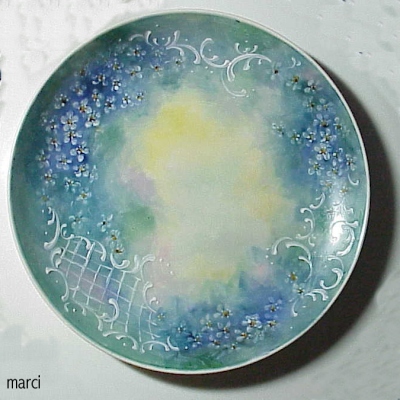
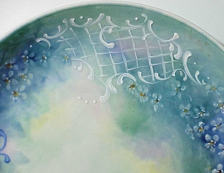
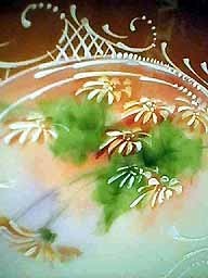
This is what the finished forget-me-not plate ended up looking like. My initial thought on this piece was to do dark blue scrolling to tie the groupings of forget-me-nots together.....but after I did one set of scrolls, I decided that the blue looked too heavy, so I wiped it off and started over, this time with Rosebud's White china paint. ( Rosebud's White paint can be found on her catalog on PPIO ) .... You can also use enamel or base for gold to accomplish the same thing....but I didn't want raised scrolling on this piece. ( Base for gold and enamel will give you a raised surface.....which is ALSO very attractive...) |
|
|
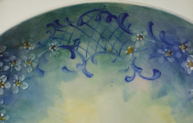
This is what the piece looked like with the blue scrolling. It worked fine...but I decided I wanted a lighter look to the piece...and also I didn't feel that the blue stood out enough in some of the areas, so I went with white scrolling. Since the overall piece was fairly dark, I decided that the white would make the piece feel a little more delicate. |
|
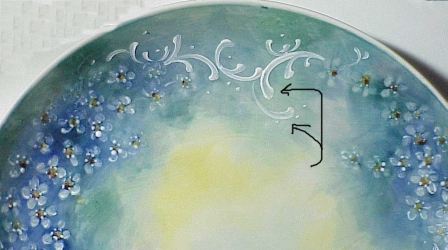
This closeup shows an area of scroll work from the
piece. You can see how I worked it into and around
the flowers to tie the floral designs together.
Also note the scrolls that have the arrows pointing
to them.....By applying a little pressure to the
brush as I worked the stroke, it pulled some of
the paint out of the center and make a pretty sort
of double scroll effect. OK, now, lets take this step by step: |
|
WHAT TO USE:
You can do scrolls with china paint
thinned with pen oil or a similar non-running medium,
base for gold or structure or enamel (mix these with
enamel medium or else with a thick oil like balsam of
copaiba or fat oil till the mixture just barely holds
together...then thin with turp.....)....
you can even use Liquid Bright gold or Roman gold to
do scrollwork ...( Liquid Bright worked over fired
china paint will have a slightly matt sheen that
resembles Roman gold as opposed to the shiny, slightly
brassy look of LB Gold on bare glazed china....
You can also use LB gold over fired structure or base
for gold.....) BRUSH: a good brush to use is a long synthetic or natural bristle liner if you are making painted scrolls... What you are looking for is a brush that has long bristles that you can fill with paint so you can make a long unbroken stroke...but that has some snap and life to it......... if you are working with the thicker pastes ( base for gold, structure, etc) , you might find it easier to work with a shorter bristled liner and also one that is a little stiffer so a synthetic bristle works well for this....and some painters use an enameling tool which is a sharpened needle-like tool with a handle..... |
|
BRUSHSTROKES: There is pretty much ONE basic brushstroke which is used to build scrolls and cartouches..... It is essentially a C stroke with a large head and a tapered tail. It is the tapering that makes a scroll look graceful..... To start the stroke, you must first have a good load of paint in your brush.... Thin the paint with a pen oil to the consistency where is flows easily off the brush.... then wiggle the brush in the paint till it is fully charged ( Loaded with paint) from tip to ferrule.... and roll the brush into a point..... |
|
Place the point of the brush where you want to begin
the scroll . To make a nicely shaped head , it helps to
do a stroke that I call my patented "Kitty Butt Wiggle".....
( Picture a kitty getting ready to pounce on something.....
and think about how they wiggle their tail end from side
to side just before they spring......then do that with
your brush...) Wiggle the brush tip on the china till you
have a nice seat for the stroke, then pull the stroke
out and away in a lazy C, easing off pressure on the brush
as you go and completely lifting the brush off the china
when you get to the tail....( Like a plane taking off)
Its the easing of pressure on the brush as you complete
the stroke that will thin the stroke down to make a nice
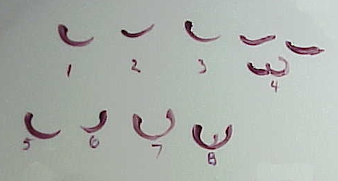
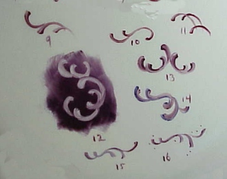
graceful tapered scroll ) (if you're working with raised paste, base for gold, structure or enamel, you wont use the Kitty Butt Wiggle to seat the stroke....instead, scoop up enough paste with the tip of your brush to make the stroke and then holding the tip of the brush so that it is barely touching the china, let the paste roll off the brush to form a dot of paste, then pull the paste around into the tapered stroke....raised paste (the yellow stuff) and enamel will "string out"..meaning that as you pull the brush away from the dot of paste, it will pull out like gum..... that makes it easy to form a nicely tapered stroke...... Base for gold doesn't string well and has to be coaxed a little but it stays on the china better...) 1. shows a nice tapering of the stroke..... 2. shows a stroke that is all the same width...the head, tail and the stroke itself show no variation...... BORING!!!!! and clumsy looking. 3. Truthfully, I cant remember WHAT stroke 3 was supposed to show......(but it IS a nice looking stroke)... (the lesson that taught ME was to NEVER try to write a lesson at 3 in the morning........ grin!) ..... 4. shows some mangy, mutant and ugly scrolls.....thick, shapeless , no taper, no smooth flow to the stroke..... the only thing you can do with strokes like this is to carefully wipe them off.....(Sometimes its tough to get the right angle with your brush on a piece and it may take a few tries to get a particular scroll to flow nicely.... so I generally work my scrolls on either white china or on fired paint...I rarely work scrolls into wet background paint.......just so I can wipe them off and start over when they start to look like example 4....... 5. More complicated strokes are built from C strokes put together.....To make a U shaped scroll, start with a right curving scroll (5), then 6. a left curving scroll that joins the right curving scroll to make a stroke that looks like 7. A nice U shaped scroll 8. You can then add other scrolls to that scroll and just keep building scroll on scroll....... |
|
Here are some variations on the basic strokes: |
|
14. and 15. show different variations on scrolls 16. shows one more variation....the addition of small dots to the design......this is optional but it can sometimes really help to lighten up a design that is too heavy looking or it can help to balance a design without overloading it..... |
|
|
|
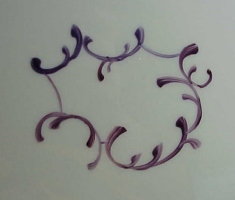
Cartouches (Kar-TOOSH )are a series of scrolls worked
together so that they form a sort of decorative frame....
The frame can be filled with crosshatched strokes as seen
in the example on the left, or it can contain a floral
or scene or anything you choose. I've seen some gorgeous
cartouches worked on plates that added a different
element to that piece: for example, a small cartouche
with a scene added to a floral piece....or a cartouche
or series of cartouches with florals added to a portrait or
scene..... As with regular scrolling, cartouches can be worked in paint, gold and /or any of the raised mediums (Structure, raised base, base for gold, enamel) |
|
Work a series of connecting scrolls using different
variations of the basic lazy C,U and S strokes.....
Note that some of the connecting strokes are just
slightly curved lines without the thicker head on them....
a few strokes like this relieve the monotony of the scrolls......
Make these strokes almost straight with just a slight curve
to visually offset the tighter curves of the scrolls. |
|
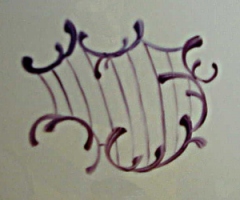
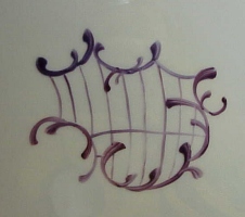
You can work a cartouche around an actual painting so the
cartouche forms a frame around it....(They are gorgeous with
little scenes, or florals in them)......but this example
shows how to do crosshatching to fill the inside of the
cartouche..... Its a good idea to start your first crosshatch line parallel to one of the looser, headless outside curves ( eg. The stroke on the left side of the cartouche)......Run the other lines parallel , keeping them evenly spaced and even thicknesses .....(this example was done working wet on wet so I was unable to wipe off the crosshatch and do over.... If this were a piece I was firing , I would have wiped out several of the lines and redone them...( some of the lines arent evenly spaced and they are wobbly.....The more neatly and evenly these can be done, the better the total effect will be......Practice helps immensely here....It will improve the flow of the lines when you can do them confidently.... |
|
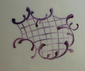
To work the opposing strokes, start at a place where you
can easily see where to work the cross strokes. These are
generally done at a 90 degree angle to the original strokes.....
altho you can do these fill strokes in a fan shaped
pattern that is very effective too...... |
|
As with the first set of strokes, keep these parallel to each other and evenly spaced.(Do as I say, not as I DID! ...grin!)......Again, you might find it easier to fire the first set of parallel strokes...and THEN tackle these perpendicular strokes, since you would then be able to wipe them off and redo them if they come out hesitant or crooked or unevenly spaced ( as these did)...... |
|
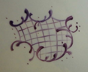
The last step is optional......You can add some dots to the cartouche to balance out spaces and to add a little pizzazz to it. It sometimes helps to make the whole piece a little daintier.... As with everything in china painting, PRACTICE MAKES PERFECT! The more you play with these, the easier they will become. The trick is to practice the strokes enough so that you can get the swing and sweep of the scroll quickly and without hesitation....... |
 Sevres piece with raised paste scrolling and gold |
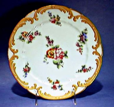
Unknown piece with enamel scrolling |
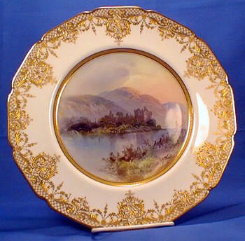
Royal Doulton piece with raised gold scrolling |
Sevres with gold scrolling |
possibly Sevres or Dresden |
possibly Limoges |
possibly Dresden |
|
|
|
CLICK HERE to go back to the ON-LINE LESSONS PAGE CLICK HERE to go back to the PPIO HOME PAGE *on-line lessons and lesson pages are the property of PPIO and the contributing artists and may not be reproduced for distribution without permission from PPIO |
|
|
|
Page design by Marci Blattenberger for Porcelain Painters International Online |