 |
Fishscales can be a beautiful embellishment on a piece...as a wide band at a plate rim or a band on a vase, perhaps. There are endless variations that you can do. I'm going to show you a few.
The MOST IMPORTANT thing in doing fish scaling is accuracy...The more even and meticulously executed the scales are, the better the design will look. ( Note that my painted examples here are NOT good examples... :o) I was trying to get this lesson completed quickly and didn't take the time to carefully render each stroke....so these illustrations are a perfect example of what NOT to do! :o)
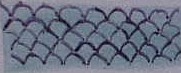
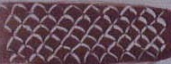
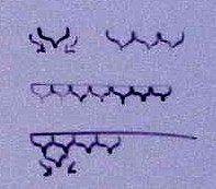
The two samples to the left show a couple of ideas: the top one shows painted fishscales and the bottom one shows wiped out fishscales......They would also be beautiful rendered over a fired color in gold .
|
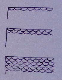 |
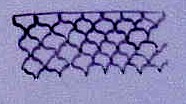
On the left, you will see an example of the simplest way to do fishscales. Again, the keyword here is accuracy and careful rendering ( unlike my hastily done examples)....so you might find it easiest, before you begin, to mark the area with division lines using a Stabilo pen or other pen that will fire out. First , mark out the horizontal rows evenly ...then you might also want to mark out the vertical spacing with small dots in , say, 1 inch increments ( or however your piece will divide up evenly)....then you can paint in 4 or 5 ( or however many you desire) scallops in each inch demarcation. REMEMBER:the more meticulous you are in rendering each stroke, the better this will look.
ROW ONE: Simply paint in (or pen in or wipe out)a line of scallops.Continue across the row.
ROW TWO: Paint in a row of scallops offset from the first row...starting and ending each of the new scallops at the middle bottom of the scallops in the row before it.Continue across the row.
ROW THREE AND ON: Repeat row two. |
|
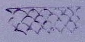
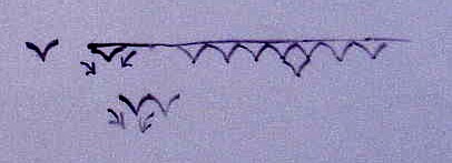
Here is another variation...This has a somewhat more elegant look...and looks complicated yet is very simple if you take it step by step.....instead of painting scallops, make a fluid V ...sort of like simple seagulls in a painting...the easiest way to do this is to start at the top and work each stroke in toward the center with a bit of a curve to the stroke ( as opposed to a straight line of an alphabet V)...Continue across the row.
ROW TWO: Start the next V stroke at the point of the V above and end the stroke at the point of the next V above...continue across the row.
ROW THREE AND ON : repeat row two |
 |
ANOTHER VARIATION: This is similar to the V stroke described above except that , instead of curving the strokes inward, you initially bulge the stroke slightly outward and THEN curve it in...(Picture an up-side-down Hershey's Kiss...for those outside the USA, a Hershey's Kiss is a bite-sized piece of chocolate that is wrapped in silver foil and has a very distinct shape.) ...continue across the row.
ROW TWO AND ON: Start the next stroke at the point of the V stroke above it....and ending at the point of the next V....continue across the row.............Repeat this pattern for each row...
|
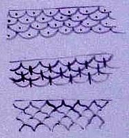 |
Some other variations...Adding dots or lines ....This would be nice with the dots or lines added in gold with the scallops or Vs done in a color...or with enamel dots... |
 |
When working on a plate rim, you can use a plate divider to equally divide out the sections ... |