Stylized Magnolia

by Birthe Hattel.....Denmark

Additional information on glass painting by Birthe Hattel can be obtained from her wonderful book , titled " Magic on Glass" which can be obtained through Backacher's Books

How to make the design:

Big flowers are always very decorative and sculptural, and have always been an inspiration to me. I take a lot of photos myself, and very often there are photos of flowers in garden magazines and others of these glittering coffee table magazines. I like the photos and love to browse in the magazines, to get ideas of all kinds, until I look around in my little house and come back to reality.

Well, back to the flowers: I trace the flower heads, stems and leaves separately, plenty of them ....more than I really need. By that I get a lot of knowledge about how they are put together and how each leaf turns and are coming out of the center, the direction and the veins......something I can use when I paint.

I make a lot of photocopies of the drawings, minimize and make them bigger. I cut these copies out, cut close to the line, and put my design together. Then I glue the whole design onto a drawing paper.

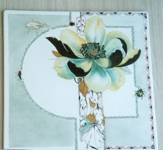
First you have to decide what porcelain you want to paint. Then choose the composition. Let's say you want a big sun behind the flowers as I did in the magnolia, or the porcelain is a big porcelain tile for a clock as for the peony.

Materials needed:
Ordinary paint dry, mix it when needed.
Waterbased painting media, I use RCP painting medias. It comes in painting medium and a thinner. The thinner is good for padding, banding and penwork. The thicker painting medium is useful for Flora Danica technique, wet in wet, and for brushstrokes.
A good thin hard pen for penwork.
A good sponge for padding, I use Carlos Spina's sponges.
Scotch blue flexible tape 2 mm. (Note from Marci: auto striping tape would also work. It can be found at most auto parts stores)
Chipping powder and a plastic bag to use when you take off the glaze with a little sharp knife (do not use your palette knife, please.) (Note from Marci: a good incising powder is made by Jean Beebe ...beebe@wave.net...or you can also use incising beads and flux.)
Base for gold, matt.
Lustres if you like (e.g. mother of pearl green, pink or yellow. These lustres have to be applied in small quick strokes, in different directions, that will give the iridescent look, if you work too much in MOP it will turn bluish gray.... the same if you pad it with a sponge to make it even.)
Liquid bright gold. Brush for the gold

Put the design together, and trace it on tracing paper. Transfer the design to the china with graphite paper. Then decide what techniques you want to use to achieve what you want: The sun behind the magnolia: chipping off the glaze. Gold on the backside of turning leaves: Base for gold, scratched in a pattern when dry. Apply it very thin, the gold turns easily dark if the gold base is too thick. (Do remember that I use waterbased painting medias, (I am allergic to turp. After 45 years of painting) they do not dry up as oil based oils and therefore they are more easy to make a pattern in with a toothpick or a wipe-out tool, the pattern are much easier to make when the paint is dry, because you can blow away the small bits of paint, and the colour will not collect up in thick wet lines.) Penwork in lines or dots. Mix your paint with waterbased RCP thinner, and add a drop of water, and it should be possible to make very fine penwork. I use a fine steel pen, hard, I think Mr. and Mrs. has the pens I use. When the paint is like a thick drop on the pen nib do add a bit more water. Washes and painting with a sponge. Painting with a brush, I use a big no# 5 pointed brush, and always synthetic brushes when painting with water base they keep the spring, hairbrushes drop dead! Negative lines made with the wipe out tool.


Now look at your painting plan, and decide what you have to do in the first, the second and the last fire. Chipping off has to be done in the first fire to get ready for the liquid bright gold. First fire: Base for gold the same. Penwork and perhaps some tinting around the design. Borders can be started as well. Structures like relief can be painted in first fire, if it is relief which is staying on the glaze and don't chip off in the second fire, so make sure of that.

First fire. The Magnolia: Chipping off powder mixed with water, put it on very wet, and soak the surplus of water up with a tissue tip. In this way it get on very even. It can be very hard to put on otherwise. This is a tip from Frau Buhler in Uster, Switzerland. Penwork. Different colours if decided. Base for gold on leaves and evt. a border. Evt. lustrework.

Second fire: Take off the glaze. Tape off for tinting or coloured wash. Apply the gold on the chipped area. Gold on base for gold Sponge thin washes on the flower, fold the sponge twice like a pillow, and pick up the paint with the corner of the sponge so you get most paint at the tip of the sponge, use that tip for outlining the shape and dab carefully along the line. Blend the colour nicely, before you fill the sponge again. Always use thin layers, and try to make the colour even. It's possible to sponge colour on top of lustre, and then make negative lines in the paint, that will give a nice effect with shiny lines. Paint the center of the flower. Paint the leaves and make negative veins in the wet paint. Clean with a cotton bud or a damp brush. Use water. Sponge the wash on, remove the tape, clean and fire.

Third fire: Tape off for the border if it,s not made yet. Paint the flowers with the pointed brush and make negative lines in the wet paint. Repeat the gold if necessary. Define the penwork if needed. Make dots in the wash with matte base for gold, if you happened to get some dust in the paint. Paint the trunk with green mixed with a bit of purple, make sure the light is on the side facing the sky.

The magnolia is painted in the same manner. The turning leaves in the flowers are painted in a dark green, to the flowers I used a ivory, chartreuse and a bluegreen. I covered the grasshopper and the insect under the flower with mother of pearl lustre. The center of the flowers is drawn with pen, and I mixed black and purple to prevent the black from chipping off. The leaves are penwork in dark purple. Bluegreen in lines behind the leaves, and gold on top of base for gold on few of the leaves. The beetles are painted in ordinary manner. The borders are bluegreen and dark purple. Other colours would be nice as well, lets say ivory, yellow rich brown pompadour, 50% purple + 50% rich brown and orange lustre. Good luck painter wish

Birthe Hattel, Denmark.


CLICK HERE to go back to the ON-LINE LESSONS PAGE

CLICK HERE to go back to the PPIO HOME PAGE

*on-line lessons and lesson pages are the property of PPIO and the contributing artists and may not be reproduced for distribution without permission from PPIO