|
|
|
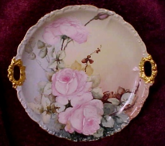
| From THIS to THIS! by Marci Blattenberger |
| This lesson is what I would have done to improve the piece in question...It is by no means the only way to do this piece.... Also, please note that the changes in the AFTER picture were done in Corel with a mouse instead of a paintbrush...so this is only a rough representation of how I would have changed this piece. |
|
|
|
|
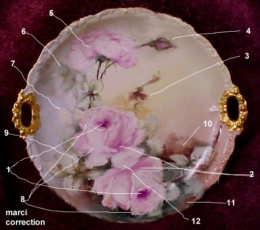
1. Deepen the inside of the bowl of the roses..this should
be one of the darkest shadows on the rose 2. Deepen shadows on the bowl on the dark side of bowl and where the petals attach to the bowl...also note that I deepened the area under the petal that overlaps the bottom rose to show that the bottom rose is under the top rose. ( In item 12, I also changed the shape of the overlapping petal ) 3. Softened the brown and yellow brown leaves, making them more indistinct. There should be less sharp detail as you get farther away from your focal point ( which is the main rose)... also, smudging this leaf grouping added more interest by letting the viewer imagine shadowy leaves.... |
|
4. I lowered and curved this bud so
that it wasnt running off the edge of the piece...
also make sure that there is continuity in the stems
....the stem that is running behind the turned-back
rose should be in alighnment with the stem of the bud
....( Visualise it continuing all the way thru the rose
...dont let the rose throw you off.) ...I also added a
little dapth to the pink at the base of the
rosebud 5. Added a little more depth of color to a few of the petals...just small dashes of color under the curled back petals and a little on the "bowl" part 6. more smudging and softening of the leaves here...notice that on the original piece, this leaf grouping pulls your eye out of the piece...but by softening it, your attention is focused back on the main flower. 7. I brought some of the yellow from the Right side of the piece over onto the left side...The original had the color stopping right at the stem area. Dont let a stem or leaf grouping be a dividing line for the background color...you should extend the background a little beyond that "dividing line".....This is the same principle as the "continuing the stemline" idea... dont let elements of the design become demarcation lines for the background.( Note that I could have also extended the blue onto the right side instead....I just felt it needed the sunlight there so I chose the yellow...but either would have worked....) 8. I changed the shape of the petals on the roses ....First , the top rose: I felt that the petals on the left side of that rose looked like they had been chopped off , so I extended them. Note that I didnt make nice rounded petals...I made every edge pointed and jagged....This makes for a more interesting petal shape....I also extended the petal that iwas touching the 4th leaf of the 4 leaf grouping so that , instead of touching the leaf, it overlapped it...That eliminated some of the visual confusion in that area. I felt that the bowl needed some visual relief so I added a diagonal "turnback petal" across the bottom part of the bowl on the left....I also felt that the top part of the bowl was getting too round and closed up looking so I added some small wipeouts around the top and the top-sides of the bowl to open it slightly....I also extended the bottom petal of that rose so that it definitely overlapped the bottom rose...In the original piece, the area is confusing with no clear indication of which rose is the top rose and which is underneath ... next, the bottom rose: I pointed up the shapes of the petals to take away some of the roundness of the original...and as in the top flower, I added some petals to the top and top-sides of the bowl to open it slightly...
|
|
I am repeating the pictures of
the plates here...both the old and new plate and the
one with the numbers so that you wont have to scroll
around quite so much.....
|
|
|
|
|
|
|
9. I reworked this leaf grouping by adding some more intense shadow over the leaves where they fall under the two roses and softening the eastern leaf....I darkened the shadow under the bottom rose and extended that to under the southern leaf, making it more visually prominent..I made the overlap of the not\rthern leaf over the western leaf more definite and fattened up the shapes of all the leaves.... The North and west leaf in this grouping are guilty of a common error in painting.. They are what the wonderful oil painter, Helen Van Wyck calls "kissing"...that is, the edges of the two shapes are just touching ,creating confusing perspective ... |
|
One should always overlap the other
( it doesnt matter which one overlaps in this case,
but there needs to be a definite overlap...which
I also enhanced by adding a little more depth
to the western leaf where it falls under the
northern leaf......) 10. added more color to this shadow area to change the shape and softened it 11. Added more depth and softened.... 12. Changed the shape of this petal on the top flower to make it definitely overlap the bottom flower . I hope this has helped you find a few things that might put a little spark in your own paintings... One of the biggest traps we fall into as painters is not using enough depth in our pieces... Think of dark and light as being the spice in our paintings...too much will ruin a piece, just as too much spice will ruin a good recipe ....but leave it out and the piece will be bland .... Happy painting! marci |
|
|
|
CLICK HERE to go back to the ON-LINE LESSONS PAGE CLICK HERE to go back to the PPIO HOME PAGE *on-line lessons and lesson pages are the property of PPIO and the contributing artists and may not be reproduced for distribution without permission from PPIO |